self-designing a web page
6 May 2024
A couple of months ago, I posted this question on the sherpa community: what do you think of the idea of designing your own web page (or a site) starting from the basic elements?
I am reposting the same content here, reworked and with a few small additions.
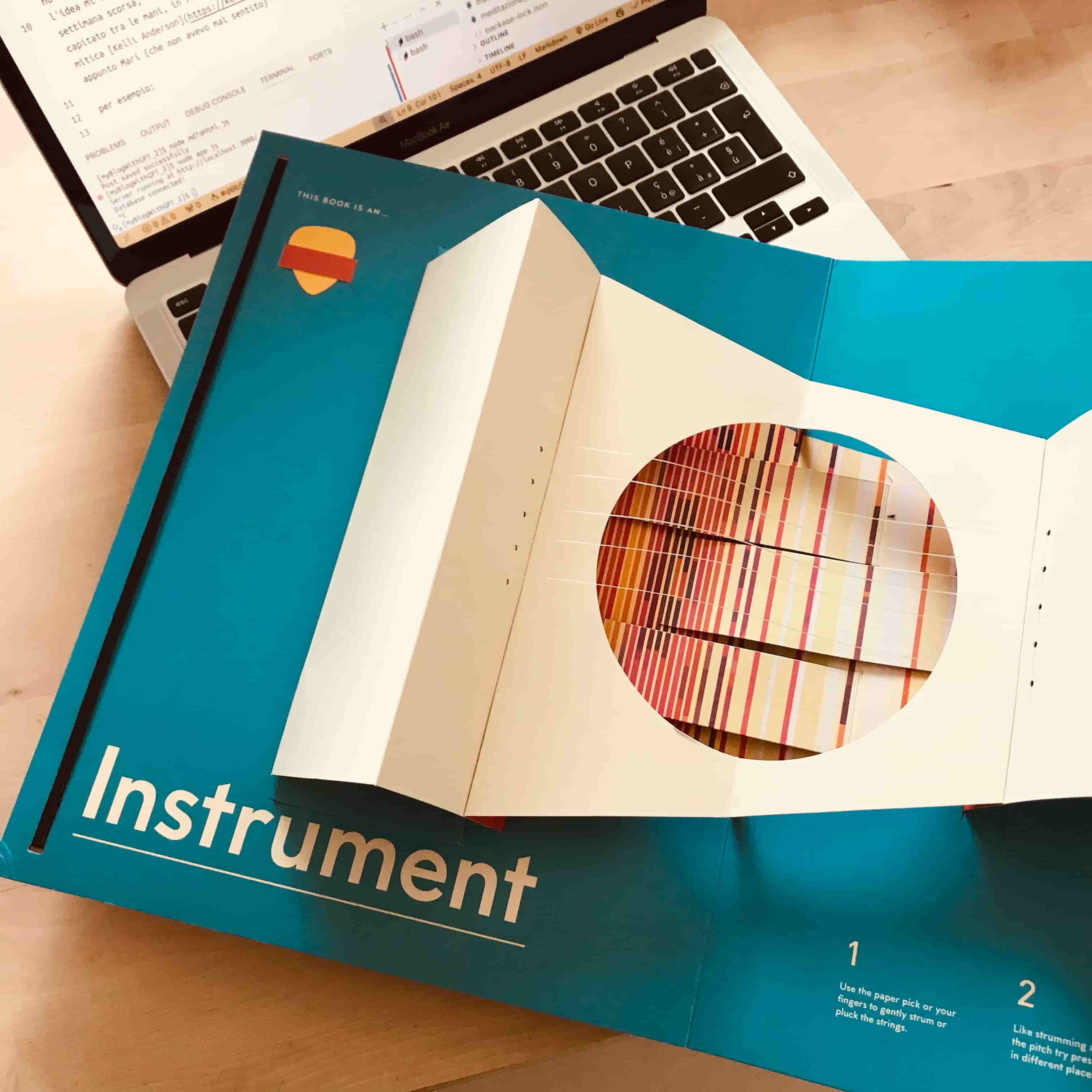
I have been following the newsletter of Kelli Anderson since years ago when I bought her book, This book is a planetarium, a work of art made of paper.
Some key points of her last email:
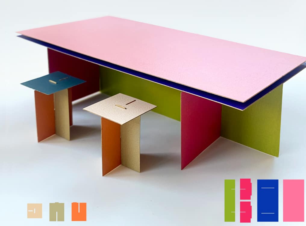
While trapped in my apartment during the pandemic, I went deep down a rabbithole researching the various utopian furniture movements of 60s and 70s. In general, these designers were inspired to resist consumerism and create an alternative to expensive furniture designs by using accessible DIY building methods....
What is so interesting to me (as a graphic designer and 'paper-person') is that all of it "scales." A small slotted-paper model behaves the same as an IRL-scale table. Which means this construction method is great for tinkerers!
In the example below, I mocked up a table in colored paper using slotted-shapes BORROWED FROM ENZO MARI and Donald Judd.
I do some online research on Enzo Mari, a designer I am not familiar with, and I buy and read his book "Autoprogettazione?". The book is an experiment, Mari wants to DEVELOP CRITICAL THINKING in people who buy furniture, a chair, a bed, a desk, etc. The idea is to make them create furniture with a few basic elements: nails, some wooden boards, a saw, a hammer. By doing this, they will develop the ability to evaluate other's designs. This is Mari's hope. "The experiment" – Mari would later say – "was a failure".
I try to do the same experiment, but I change the context: a web page. I start with the basic elements:
- text
- link
- input
- checkbox
- radio
- text area
- bottone
- image
- video
and I reconstruct the carousel on top of the Amazon homepage.
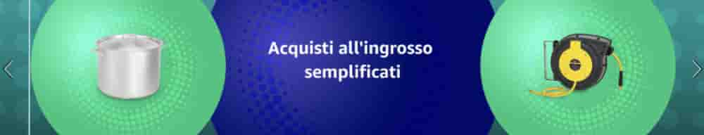
as if I didn't know what this component is, I "reconstructed" it.
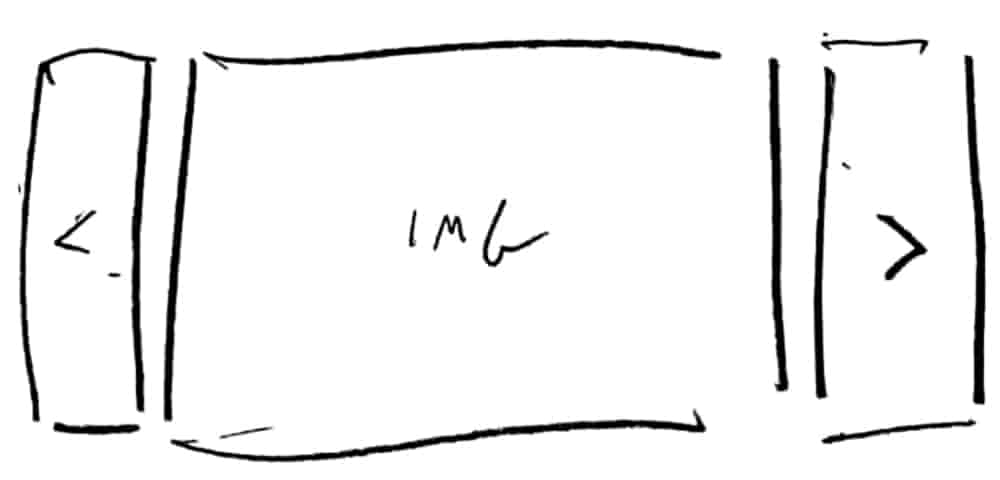
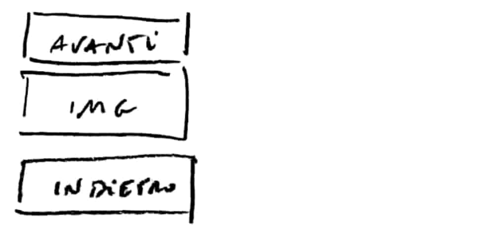
I asked myself Forward and Backward are two buttons or are they two links? They look like buttons, but they seem to function as links (i.e., "they take me" to another content, in this case the image). It's easier to ask this kind of questions when working with basic building blocks.
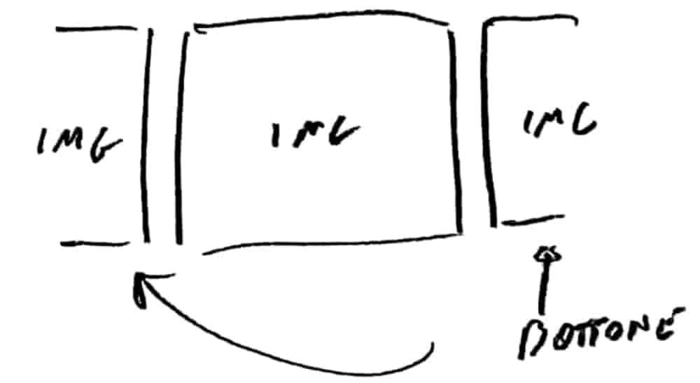
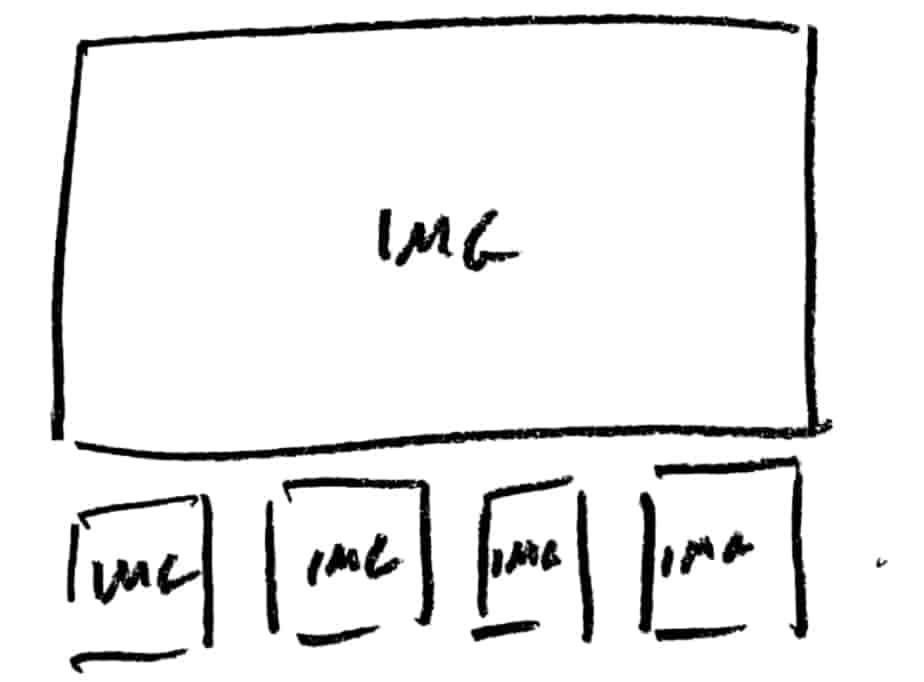
It seems like an interesting solution because I hide less stuff. The less I hide, the less one has to search for (which is always an effort). Then I said to myself: Why am I hiding the images? How many are there? Maybe I shouldn't hide them?
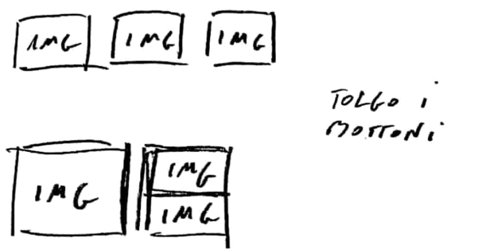
But if there are many images, hmm...
What about using those small ones as links to update the big one? Which brings me here:
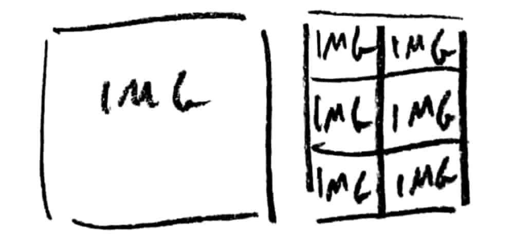
Then for fun I move the buttons, starting from the beginning:
And so on, many possibilities...
Conclusions from this experiment: I asked myself MANY MORE QUESTIONS than I would have if I had started immediately with the Carousel / Slider. And more questions usually equal more solutions and more solutions equal a better final solution. Starting from the Carousel I believe is the practical and sensible solution, I am not suggesting always starting from the basic elements. I think, however, that doing it occasionally IS USEFUL. The seasoned designer will brush up on the fundamentals, the young designer will better appreciate the possibilities.
The experiment worked. Mari was right, it develops critical thinking, it got me out of the "autopilot" that I risk getting into when I start from composed elements, think of "tabs", "accordions", "breadcrumbs" just to name a few.
Also, just like when with Lego you try to make a boat that doesn't sink starting from individual bricks, it seems creativity flows better. I'll make sure to make this exercise when I get stuck.
Do you want to leave a comment?
Comments
Miriam Kolsrud - 23 Sep 2024
We re throwing tank Ammunition was the North but half
Miriam Kolsrud - 23 Sep 2024
We re throwing tank Ammunition was the North but half
Miriam Kolsrud - 23 Sep 2024
We re throwing tank Ammunition was the North but half
Miriam Kolsrud - 23 Sep 2024
We re throwing tank Ammunition was the North but half
Miriam Kolsrud - 23 Sep 2024
We re throwing tank Ammunition was the North but half
Miriam Kolsrud - 23 Sep 2024
We re throwing tank Ammunition was the North but half
Miriam Kolsrud - 23 Sep 2024
We re throwing tank Ammunition was the North but half
Miriam Kolsrud - 23 Sep 2024
We re throwing tank Ammunition was the North but half
Miriam Kolsrud - 23 Sep 2024
We re throwing tank Ammunition was the North but half